Tuesday, December 14, 2010

Reflections

I've posted these videos before, but I'm posting them again to reflect one what I've learned this semester.

Forgetting Oneself from Kim Berens on Vimeo.


It seems strange, but it feels now like this wasn't my first stop-motion video. It seems like I'd done it before this. When I was making it it didn't seem like I'd done it before this, but now it does. Maybe because I've seen so much stop-motion since and done a couple more project using the method.

When my professor introduced us to this assignment, my first thought was, "how can I use Photoshop?" I came up with having an invisible person. Every frame where skin appears I cut the person out and added the inside of the clothes that would then be visible. I also added the light when the light turns on because it was washed out.

I think people liked the video because it was unexpected that the person in the video would not have a body. After that it's the, "how did they do that?" reaction. If I saw a video like this, I'd want to know how the artist did it, even if I knew how I would do it, I would want to know how another would attempt the same thing.


Vote Nov. 2nd to Save Troy Library! from Kim Berens on Vimeo.

With the Vote November 2nd to Save Troy Public Library, I learned... don't post a political information video the day before the election when you're attempting to sway the votes. Of course, this wasn't entirely my fault. If you consider the circumstances and use a few key synonyms then it may even appear that I'm an ambitious, determined and enthusiastic worker! (which is my attempt in the following sentences). The election (obviously) was November the second, but the project wasn't even due until the ninth! Professors usually give adequate time to do an assignment, and having it done a week early was very difficult. Regardless of posting it so late, 9 people liked the post and three people commented. It's not very much, but a couple of the people I don't even talk to! So it made me feel good.

There were of course problems. For whatever reason, when exporting a 24 fps file as a Quicktime, the video had ghost images, which were ugly and made it hard to understand the video. But I needed to post it. I figured that as long as I got the word out there, people would mind the ghost images. For my class however, I either had to change it to 12 fps and cut out half the frames (looong and tedious) OR, what I ended up doing, which sounds convoluted, but really is quite straightforward: I exported the video (without audio)as a swf file and imported it into After Effects, then exported it as a Quicktime and imported it into Final Cut, where I added the audio and exported it again as a Quicktime. See, really not difficult.

And the week after November second was niiiice.

As for the content, I think it comes across very well. My Dad, who I believe to be very politically knowledgeable, gave his thumbs up, and many people from Troy liked the video on Facebook, meaning they understood the message.

It was a great introduction to Flash and time-based media, something I really enjoy and, as a designer who has spent many years dedicating hours to Photoshop, I seem to be spending a lot of energy on pursuing time-based design!

Monday, December 6, 2010

Blog Prompt #24 - Final Project

My final project in color photography, I really want to make a series using this image below.


I made this last summer for fun using cyanotypes for the hair and painting in a lot of the the original image using Photoshop brushes. This might just be one of my most favorite things I have ever made. Especially since I didn't use any of the artistic or brush stroke filters. The only thing I did not make was the paper texture. I found that online at a free texture website. Whether that is legitimate or not, I have since wished that I had done the paper texture


I have photos of family and friends that I'm going to use. So far I have three white males and an Indian girl, so I'm going to have to take some more pictures so I don't accidentally make some controversial statement about race and gender that I never intended. I've done some more cyanotypes, that unfortunately didn't  turn out, but luckily, for my particular assignment, it doesn't really make a difference (the professor who lent the chemicals to me reckons the chemicals might have been accidentally mixed together at some point).


I also have created my paper texture by rubbing instant coffee on paper and then baking it. It, er, worked, but it's not quite the texture I imagined. Who knows, I might end up liking it, but we'll see. I may make a trip to Hobby Lobby's scrap-booking section, however.

Thursday, December 2, 2010

Somewhere Over the Rainbow

These pictures are actually from assignment #4 for my color photography class, but I never posted them! I posted the works-in-progress, but not the final images! But alas, here they are!


The first three images are the ones you've seen before. They haven't changed too much (except maybe the last one) since the works-in-progess.
The idea came from this amazing cover of Over the Rainbow by Israel Kamakawiwoʻole (originally from the Wizard of Oz). My sister loves the song as well, and when I came up with the idea for these images, it was a time when both Beth and I were really happy and constantly listening to this song. The song and these images just make me feel that happiness is bigger than just one person or two people - that people can spread happiness to other people just by being pleasant. 
I think the song is about Dorothy wanting a life with meaningful happiness, which is ultimately what she gets at the end of the movie when she returns to her family after wishing to go home. I feel the person in my images has already achieved that wisdom and is happy with her family and with her life, but she still likes to take her time just for herself, when she goes over the rainbow (there's a rainbow in the second image).
As for the order of the images, I really don't know. I like them in this order the best, but it doesn't really make sense. One image is over in the clouds, the second is her flying into the sky, and the last is her on the ground (probably), and the colors of the sky don't match up either. These are the way I originally imagined these images, and I never changed it. I tried, but I didn't like anything else, I like the way these look.


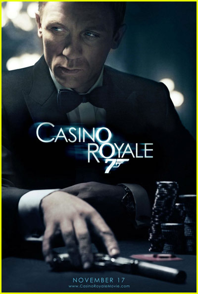
This last image I made in a night, the night before I had to print the images, actually. I went home and thought, I have to have one more image for my class. I had never done to re-make of a movie poster, which, if you know me, is very odd that I didn't do it for every assignment. I want to make movie posters as my career. I feel like most of the art I have created in my lifetime has been preparing me for my future career as film key art designer (posters, etc.) I just love it. I re-make my own movie posters for fun (mostly Harry Potter). I love trying to copy exactly, because then I learn why the designer did this instead of that. One can learn a lot from copying. I've made posters for a few students films, and I got to use my knowledge I gained from copying the masters!
Anyway, so I didn't have a lot of time, because I'd spent most of my time working on the above images. I looked through my movie posters inspiration folder on my computer and selected this Casino Royale poster. I didn't have a gun (real or fake) to use, however, and my roommate suggested I use my wand. I could not think of one legitimately good reason not too, so I did. I set up the lighting as closely to the original as I could. I shot it myself, so I thought it would be really hard to get the pose right. It isn't perfect, but it's close. I actually think the real reason it's not perfect is my shoulders are a lot smaller than Daniel Craig's shoulders. His simply fill more of the frame than mine could possibly. I did my best. In the end, it probably doesn't matter. I'm very pleased with the way it turned out. 
It might surprise you to learn that, not only is the background completely photoshopped from brushes (there is a very blurred out and nearly transparent picture of a house, just to give random variation of tone), including the lights, which are just several layers of the same things but slightly different opacities and colors, but the figure is actually made of up of three different images! One for my hand, one for my body and one for my head. As I was shooting this myself, running from camera to seat and posing in ten second, it was hard to get it completely right. So I just photoshopped it together. I think it's perfectly okay in this situation (unlike here, where I would have preferred to do it right during the shoot). In fact, I prefer photoshopping things for posters, I feel it's on of the few acceptable places to do so, and therefore I want to take advantage. As long as I never churn out anything like this Huckleberry Finn poster. First of all, it doesn't even look like Jim is running. But the worst part is, if you see the movie, you know the body of Elijah Wood is actually another character altogether. It's...  I mean, the poster's purpose is to make one want to see the movie, but once one does, it's obvious the body belongs to someone else!
I've been holding that in for years.


Monday, November 29, 2010

Lazy Sunday

Here is my video piece for my color photography class. I'm quite proud of it. That is, I find it really amusing. Thanks Lindsey for the idea at the end. ; )


Also, I have my other piece, which didn't take nearly as long, but I still find it fun. It is supposed to resemble the American Idol ads.


And then the image off the billboard.


With the video, I took pictures from my bed (I love my homework). I tried to make the first pictures abstracted, because the person is waking up and nothing really makes sense. But then as the sleeper stays in bed and slowly wakes up, the images become more clear and readable. I created the inside of the eye lids in Flash, exported them as jpegs, imported them into Final Cut, and added the blur in there. There is probably a better way, because I had to blur every single frame. Which wasn't too bad for this assignment, but for anything longer, that would have been really annoying. But this way I got to control how much blur I wanted in each frame. At the beginning of the eye opening and the end of the eye closing, the blur looks way to heavy at 100%, so I the beginning and end have around 30% and it works it's way up to 100%. Surprisingly that looks a lot more smooth than all frames being 100%.

The Darth Vader thing was a suggestion of one of my friends, Lindsey, as a joke. I did it anyway, and it was hilarious late at night when I was working on the piece, I still think so, but it didn't get much of a reaction from my class at 8:30 in the morning. Which is great in itself. But, yeah, the Darth Vader thing isn't part of the piece, really, and if you visit my vimeo, you'll find that bit missing.

As for my American Idol billboard, I just tried to look to the actual American Idol ads. Just to capture the spirit of the ad while making it look like it maybe came from a different season. I shot my friend in a unique, rock-star-y and hip-hop-y outfit holding a guitar, so it kind of speaks to all types of musicians: country, rock, pop, R&B, etc. I tried to keep the treatment of the type as close to the original ads as possible. It's a different font and texture, but I think it matches pretty closely, and I'm pleased with how it turned out.

Blog Prompt #23

This picture here by Thomas Berger is amazing! It was literally the first picture I clicked on, simply by random. But when I opened it I got so excited! It looks like a pop-up book, yet it is an image that, to me, looks like it was done in Photoshop. It's still great if it wasn't done in Photoshop, perhaps more so. I think this might be something I would really love to explore. I love creating depth to images in Photoshop, which of course is fake depth. I always try to make it look as real as possible, but here, Berger acknowledges the fact that it's completely fake and uses that to create a beautiful surreal landscape.
I naturally assumed the rest of Berger's pictures would be equally amazing, but a lot of them looks like ordinary photos. But the pop-up pictures are truly inspiring.

Sarah Blumé is an artist who is responsible for this image. It's very similar to the idea I had of recreating my comic book I wrote in high school. Drawn images with real background. Well, "real" in my case, but still. People who create images like this are without a doubt creative. Even if this idea is not completely new, a person who wants to play around with a camera would probably go outside before photographing an image like this. I think it's very inspiring and hopefully something here I can use in my own work.


Mark Jenkins is an example of a photographer who's work is based more on content than style. His work is sometimes humorous and sometimes I-guess-it's-funny. He has one image that has a red carpet, the epitome of glamour and fame, that leads to a manwhole in Washington, DC. A large portion of his website is dedicated to photos of plastic bubble-like children doing interesting (or not interesting) things around the city, such as pulling down signs, climbing statues or billboards. It reminds me of Jan von Holleben, who I would also say his work is more about content rather than having the perfect "look". I think it is a admirable quality in a photographer, because these are the works that speak to us rather than just being something nice to look at. I think every photographer has something to learn from photographers like Mark Jenkins.

Tuesday, November 23, 2010

A Lazy Sunday

Here's what I'm currently working on. It's a video, but it's not for my Time and Motion class - it's for my photography class! Imagine that


What this video is supposed to represent is an eye opening as the person rolls over in bed, contemplating getting up. I'm hoping to make the eye movements smoother. I exported the flash file as jpeg, but I think there needs to be more jpegs to create a smoother transition. I'll see what I can do.

Thursday, November 18, 2010

Save the Library (If You Can Turn Back Time)!

I previously posted this video, but it looked very strange with ghost images making it difficult to see what was going on, so I finally fixed it up and here's the final video! The purpose of this video is long since redundant, but hopefully you will still manage to find some merit within the tweens and voice-overs.


Save the Troy Library at the November 2nd Election! from Kim Berens on Vimeo.