I found thees really neat commericals on ISO50s blog, and they are quite stunningly shot and the message is inspiring for anyone who really wants to travel and learn new things (me).
EF - Live The Language - London from Albin Holmqvist on Vimeo.
EF - Live The Language - Beijing from Albin Holmqvist on Vimeo.

Saturday, February 26, 2011
Friday, February 25, 2011
Motion Book Cover?
I've been sick the last couple of days and have done a lot of sleeping, but there comes a point when you don't want to sleep anymore. At that point I went to class (bad idea). The next day, as I was still sick, I took the entire day to catch up on work (it kind of worked). Mostly I slept and when I wasn't sleeping, I thought about future projects.
One of the projects I thought extensively on was my thesis in my photography workshop class. I thought it was about time I narrowed it down. I've been doing a lot of experimenting with after effects tutorials, which is a lot of fun, but not exactly helping me narrow my thesis. The tutorials are more giving me too many ideas and of increasing difficulty. So I sat down and decided I needed to have a story with which to grow an idea. Well, I don't need a story, more that I want one. I like the restriction that come from representing something like a story. When you literally can do whatever you want, it becomes more difficult, which is what I was facing. I wanted to make all these cool things, but there was no concept, so it was hard to hold on to one idea over another.
Well, my brother wrote this book last year that he let me proof-read over the holidays and I loved it. I've been getting really into motion posters, or living moving posters, but with nooks and other forms of digital books, why not motion book covers? So that's what I'm making. A living moving motion book cover.
Now the only issue is somehow making it a photography assignment. Something I forgot until after I called my brother and we discussed important themes of the book that could be presented in the cover design, did a handful of sketches, and made mock-ups in Photoshop. So I was already really invested in the project before I realized it was all digitally created and not a spot of photography in the entire design. Oops. As I love texture, I had always been planning on using a texture, but even the texture I was planning on using I was going to create in the computer! It's not at all more difficult to use photographs as textures, which will probably look better anyway. Also, before I had planned to design a cover for my brother's book, I really wanted to work with torn paper edges, so I can somehow incorporate scans of torn paper, which I think would look really nice.

Mostly, I'm just ecstatic to play around with it and see what I can do. I don't think anybody has ever done a motion book cover before, so there are no rules!
Thursday, February 24, 2011
Intended to Un-confuse You About The British Isles
I'm not sure how I found this, but I did, and I think it's a great video, especially since I love the British Isles.
Monday, February 21, 2011
Keith Loutit
Keith Loutit
Biography
Keith Loutit is from Sydney, Australia. He considers himself himself both a photographer and filmmaker. Although he is not the only photographer to experiment with tilt-shift and time-lapse techniques, his artwork seems to use the techniques in a way that really miniaturize the subject.
Significance
Loutit is one of the first photographers to experiment with the tilt-shift photography from such a great distance so that the subject matter looks like miniatures. He has been hired for commercials and has used the technique on his own, but as of yet, there is still a lot of room for application with this type of photography.
Art Historical or Photographic movement
Loutit works uses time-lapse video to create his stop-motion videos. Stop-motion can be so drastically different, and Loutit has found a way to update what stop-motion can do.
Rievew
I couldn't find an officially published review of his work, but I found several blog and forum critiques, the most official lookingbeing a review by Clay Parker Jones at ExitCreative.net, which is really just an explanation of what tilt-shift means. Other, more casual looking bloggers wrote how they enjoyed Loutit's work. They all said a variety of the same things, including how at first they thought it was miniatures or claymation, but through studying the videos realized it couldn't be and through research discovered these images were of real people and real boats, etc. After that, they all said how it was simply really neat and one must check it out.
Composition
Loutit's composition is dictated by the subject matter, be it a house, boat, or field. In the examle of a boat, the subject matter moves, and he doesn't necessarily know where to, so I think a lot of it is just point and hope for the best. That or the composition is not entirely important to the overall piece.
Concept
Loutit's series Small World's has been his most famous series. He traveled the world to document famous cities, monuments, and people. The people seem so tiny and abstract, so there are very little differences. Loutit is trying to say that today with increasing communication, the world seems smaller, but through Loutit's work we see mankind working together building things and driving and lounging at beaches or going to ballet class.
Method
He shoots several shots a second with a tilt-shift lens on his video camera, which creates the illusion of the subject being a miniature. Using a time-lapse to capture fewer frames per second makes the video seem more like a stop-motion rather than a video, where the "normal" frames/second is 24-30.
My Opinion
I think Loutit's work does a good job of expressing his intention - that mankind works together to create society, which is evident from the perspective that Loutit shoots from. His work is aesthetically unique, which makes it stand out. I think he just simply has fun with it, and that's a great reason to continue doing it.
Tuesday, February 15, 2011
2011 PIEA and ADDY winning entries
 |
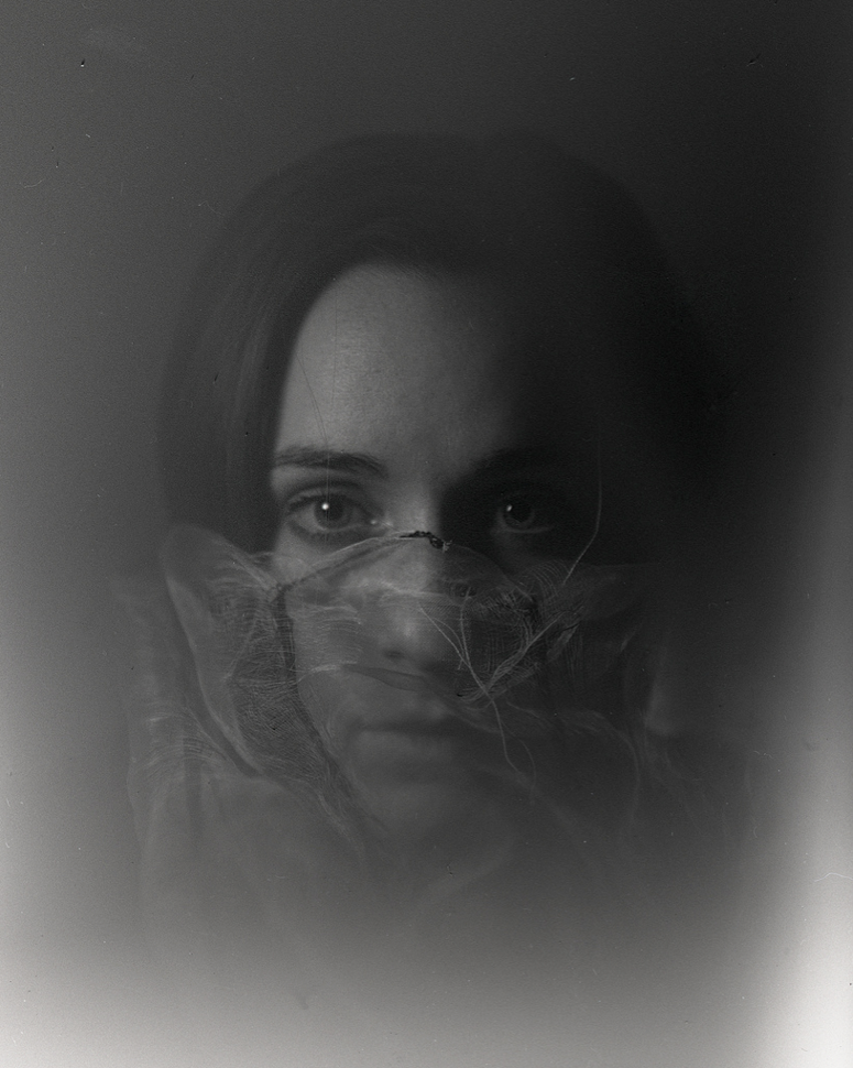
| Satpreet Kahlon, PIEA Honorable Mention Portfolio |
It must be the bright green wall in our apartment or something, because my roommate, Satpreet, and I both won during this year's PIEA international photo contest. We're the only winners from Michigan State this year, which makes it even more bizarre. The poetic bit is that I wouldn't have entered if it weren't for Satpreet's mentioning the contest to me. She was very confident I would win something.
Satpreet received an Honorable Mention for her entire portfolio, of which she submitted a lot (a lot). Her portfolio is amazing, and here are a few sample of a series she did with the view camera.
 |
| Satpreet Kahlon, PIEA Honorable Mention Portfolio |
 |
| Satpreet Kahlon, PIEA Honorable Mention Portfolio |
Our professor had actually been looking for Satpreet to tell he she'd won, but he found himself in my class instead. When he said she won, I literally jumped out of my chair to hear more details. Then he told me I'd won too. First Prize in the Digital Construction category.
 |
| Kim Berens, PIEA First Prize Digital Category |
This morning I found out I also won a Gold ADDY in the mid-Michigan ADDY Awards for a series I had done that was directly inspired by the image that won me the PIEA First Prize. The series I turned in for my Color Photography class and included the piece the original for the assignment.
 |
| Kim Berens, Gold ADDY Award Winner |
 |
| Kim Berens, Gold ADDY Award Winner |
 |
| Kim Berens, Gold ADDY Award Winner |
 |
| Kim Berens, Gold ADDY Award Winner |
The original and the new series are similar, but I do think they are distinct enough that for an exhibition I would not show them together. I feel the original is a great stand-alone piece, but the new series does work best as a series. Except the first one I show here, I do feel could stand alone.
Textual Tension
The latest assignment for my photography workshop class was to combine text with an image. I've done this many times before (duh, posters), but I it had been a while since I'd done it just because. When I was younger and everything was an experiment I would often just have random poems or quotes just so I could add text to an image. 90% of the time the text had nothing (nothing) to do with the image. I had a lot of fun during those experimental days, but for this assignment I wanted the text to relate to the image.
I also thought my professor might appreciate that too.
I had these pieces on my bureau (I think dresser is a more common name) in my bedroom. They aren't arranged like this on the bureau, but after staring at them for a while I decided this scene would be a hilarious arrangement, and not only that, but I should photograph it.
I didn't originally shoot these for this assignment, but once I was shooting, I thought several of the compositions would look great with text added, so I thought why not?

Buuuut, once I edited this version, and created a text box I suddenly sat there like, ".........................". I complained to my sister that there wasn't anything that would make this funnier. Inherently, it had to be silent. She tried to encourage me, but I was very set in my ways. Nothing would work.
I look through other photographs, because at this point there wasn't enough time to reshoot. There really wasn't anything I felt like working with, so I opened up the image again and inside the text box I made an ellipsis, "...". I thought that might count as text, so I put the image inside those three dots(actually, that's a lie, I did it this way because it looks like a lego, and I was playing off the lego characters in the scene) <- That's not true at all, just really coincidental.
But once I had the dots, I thought the images were a bit more difficult to read (no pun intended), especially the buffalo, so I wrote, "dead buffalo" underneath it, which seems to clarify and have a certain blunt humor also. Underneath Hermione (the second circle) I wrote "embarrassed driver" (Ron was supposed to have been driving, but I put him on the wrong side of car. But in the text image, the telephone booth isn't in the image, which means they could be taking a trip to the U.S., so really I could have done anything), and underneath Ron I wrote, "surprisingly innocent" because he probably would have gotten into an accident as he used a confundus charm during his driving test.

I thought the image would still be kind of odd to read, but the students in my class seems to understand what it meant, although I did explain it to them. Perhaps they were just being nice. But it was generally well received. I think the piece is still stronger without the text. A strong, silent type of photograph, if that makes any sense.
Actually, that last sentence describes the photo horribly.
I also thought my professor might appreciate that too.
I had these pieces on my bureau (I think dresser is a more common name) in my bedroom. They aren't arranged like this on the bureau, but after staring at them for a while I decided this scene would be a hilarious arrangement, and not only that, but I should photograph it.
I didn't originally shoot these for this assignment, but once I was shooting, I thought several of the compositions would look great with text added, so I thought why not?

Buuuut, once I edited this version, and created a text box I suddenly sat there like, ".........................". I complained to my sister that there wasn't anything that would make this funnier. Inherently, it had to be silent. She tried to encourage me, but I was very set in my ways. Nothing would work.
I look through other photographs, because at this point there wasn't enough time to reshoot. There really wasn't anything I felt like working with, so I opened up the image again and inside the text box I made an ellipsis, "...". I thought that might count as text, so I put the image inside those three dots
But once I had the dots, I thought the images were a bit more difficult to read (no pun intended), especially the buffalo, so I wrote, "dead buffalo" underneath it, which seems to clarify and have a certain blunt humor also. Underneath Hermione (the second circle) I wrote "embarrassed driver" (Ron was supposed to have been driving, but I put him on the wrong side of car. But in the text image, the telephone booth isn't in the image, which means they could be taking a trip to the U.S., so really I could have done anything), and underneath Ron I wrote, "surprisingly innocent" because he probably would have gotten into an accident as he used a confundus charm during his driving test.

I thought the image would still be kind of odd to read, but the students in my class seems to understand what it meant, although I did explain it to them. Perhaps they were just being nice. But it was generally well received. I think the piece is still stronger without the text. A strong, silent type of photograph, if that makes any sense.
Actually, that last sentence describes the photo horribly.
Sunday, February 13, 2011
William Klein
William Klein
Biography
William Klein was born in the good ol' month of April, on the 19th, in 1928, which makes him 82 years old today. He was born in New York, but in his late teens he moved to France. He trained as a painter with Fernand Léger, and found success, but he clearly moved to photography, which is what he is known for today.
Significance
He is a fashion photography and photojournalist, and he often used photojournalistic approaches in his fashion photography. The concepts behind his photography were often ironic, and he used unconventional methods of photography in his lighting and framing. He also utilized motion blur often and played around with different lenses. He also experimented with putting photography and painting together. He was hired to photograph New York at the same time as photograph a fashion spread. This might be the reason his fashion photography is so street-driven. He was also not interested in fashion, so he used the opportunity to create the art he wanted to create, which led people to see fashion photography as a whole new type of artistic expression. He later stopped his photography and became a filmmaker, making several documentaries, but returned to photography in the 80s.
Art Historical or Photographic movement
Klein had interest in abstract painting, which is interesting that he would also be interested in photojournalism as they are both very different ways of telling a story
Rievew
Minor White's review of William Klein's "New York", a series of photographs Klein took while visiting his birthplace. White, a photographer himself, did not enjoy Klein's work, and called it "vulgar" and that it captured the "bawdy, gaudy and tawdry". He states that Klein did not photograph a city, but used cheap photography to show the vulgarity of life.
Composition
Klein used unconventional framing, making photos look more like journalistic photos even when they were fashion photographs. He also used motion blur a lot on faces and the bodies. I think this is another aspect of his interest in photojournalistc style. He would overexpose much of his film, which led to the blurriness. His use of high-ISO film made his exposures very grainy.
Concept
Klein was interested in creating an ironic and ambivalent look at fashion, probably because he was not particularly interested in it, and didn't take it as seriously as others in the industry. For his New York series, he was interested in photographing it in a way that hadn't been done before and his "foreign" look at the city gave him a different perspective, as he'd been out of the country for six years.
Method
Klein played a lot with high light-sensitive film and different lenses on his camera to get different affects. As he was not trained as a photographer, a lot of his photography was very experimental.
Motivations
Klein photographed fashion, but as he wasn't interested in fashion, his got his motivation for it by using the opportunity to make great photographs. He often has his models on the street. He also liked breaking the rules and challenging authority, which he learned from his teacher, Fernand Léger.
My Opinion
I think that William Klein should be very happy with his life because it seems like he does what he feels inspired to do and he was successful. His passions changed throughout his life, which is okay. He didn't stay with an artistic medium that he was tired of, but went to a new one. Eventually he came back to photography when he rediscovered how much of his early photography he liked.
Subscribe to:
Posts (Atom)