Tuesday, December 14, 2010

Reflections

I've posted these videos before, but I'm posting them again to reflect one what I've learned this semester.

Forgetting Oneself from Kim Berens on Vimeo.


It seems strange, but it feels now like this wasn't my first stop-motion video. It seems like I'd done it before this. When I was making it it didn't seem like I'd done it before this, but now it does. Maybe because I've seen so much stop-motion since and done a couple more project using the method.

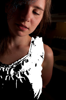
When my professor introduced us to this assignment, my first thought was, "how can I use Photoshop?" I came up with having an invisible person. Every frame where skin appears I cut the person out and added the inside of the clothes that would then be visible. I also added the light when the light turns on because it was washed out.

I think people liked the video because it was unexpected that the person in the video would not have a body. After that it's the, "how did they do that?" reaction. If I saw a video like this, I'd want to know how the artist did it, even if I knew how I would do it, I would want to know how another would attempt the same thing.


Vote Nov. 2nd to Save Troy Library! from Kim Berens on Vimeo.

With the Vote November 2nd to Save Troy Public Library, I learned... don't post a political information video the day before the election when you're attempting to sway the votes. Of course, this wasn't entirely my fault. If you consider the circumstances and use a few key synonyms then it may even appear that I'm an ambitious, determined and enthusiastic worker! (which is my attempt in the following sentences). The election (obviously) was November the second, but the project wasn't even due until the ninth! Professors usually give adequate time to do an assignment, and having it done a week early was very difficult. Regardless of posting it so late, 9 people liked the post and three people commented. It's not very much, but a couple of the people I don't even talk to! So it made me feel good.

There were of course problems. For whatever reason, when exporting a 24 fps file as a Quicktime, the video had ghost images, which were ugly and made it hard to understand the video. But I needed to post it. I figured that as long as I got the word out there, people would mind the ghost images. For my class however, I either had to change it to 12 fps and cut out half the frames (looong and tedious) OR, what I ended up doing, which sounds convoluted, but really is quite straightforward: I exported the video (without audio)as a swf file and imported it into After Effects, then exported it as a Quicktime and imported it into Final Cut, where I added the audio and exported it again as a Quicktime. See, really not difficult.

And the week after November second was niiiice.

As for the content, I think it comes across very well. My Dad, who I believe to be very politically knowledgeable, gave his thumbs up, and many people from Troy liked the video on Facebook, meaning they understood the message.

It was a great introduction to Flash and time-based media, something I really enjoy and, as a designer who has spent many years dedicating hours to Photoshop, I seem to be spending a lot of energy on pursuing time-based design!

Monday, December 6, 2010

Blog Prompt #24 - Final Project

My final project in color photography, I really want to make a series using this image below.


I made this last summer for fun using cyanotypes for the hair and painting in a lot of the the original image using Photoshop brushes. This might just be one of my most favorite things I have ever made. Especially since I didn't use any of the artistic or brush stroke filters. The only thing I did not make was the paper texture. I found that online at a free texture website. Whether that is legitimate or not, I have since wished that I had done the paper texture


I have photos of family and friends that I'm going to use. So far I have three white males and an Indian girl, so I'm going to have to take some more pictures so I don't accidentally make some controversial statement about race and gender that I never intended. I've done some more cyanotypes, that unfortunately didn't  turn out, but luckily, for my particular assignment, it doesn't really make a difference (the professor who lent the chemicals to me reckons the chemicals might have been accidentally mixed together at some point).


I also have created my paper texture by rubbing instant coffee on paper and then baking it. It, er, worked, but it's not quite the texture I imagined. Who knows, I might end up liking it, but we'll see. I may make a trip to Hobby Lobby's scrap-booking section, however.

Thursday, December 2, 2010

Somewhere Over the Rainbow

These pictures are actually from assignment #4 for my color photography class, but I never posted them! I posted the works-in-progress, but not the final images! But alas, here they are!


The first three images are the ones you've seen before. They haven't changed too much (except maybe the last one) since the works-in-progess.
The idea came from this amazing cover of Over the Rainbow by Israel Kamakawiwoʻole (originally from the Wizard of Oz). My sister loves the song as well, and when I came up with the idea for these images, it was a time when both Beth and I were really happy and constantly listening to this song. The song and these images just make me feel that happiness is bigger than just one person or two people - that people can spread happiness to other people just by being pleasant. 
I think the song is about Dorothy wanting a life with meaningful happiness, which is ultimately what she gets at the end of the movie when she returns to her family after wishing to go home. I feel the person in my images has already achieved that wisdom and is happy with her family and with her life, but she still likes to take her time just for herself, when she goes over the rainbow (there's a rainbow in the second image).
As for the order of the images, I really don't know. I like them in this order the best, but it doesn't really make sense. One image is over in the clouds, the second is her flying into the sky, and the last is her on the ground (probably), and the colors of the sky don't match up either. These are the way I originally imagined these images, and I never changed it. I tried, but I didn't like anything else, I like the way these look.


This last image I made in a night, the night before I had to print the images, actually. I went home and thought, I have to have one more image for my class. I had never done to re-make of a movie poster, which, if you know me, is very odd that I didn't do it for every assignment. I want to make movie posters as my career. I feel like most of the art I have created in my lifetime has been preparing me for my future career as film key art designer (posters, etc.) I just love it. I re-make my own movie posters for fun (mostly Harry Potter). I love trying to copy exactly, because then I learn why the designer did this instead of that. One can learn a lot from copying. I've made posters for a few students films, and I got to use my knowledge I gained from copying the masters!
Anyway, so I didn't have a lot of time, because I'd spent most of my time working on the above images. I looked through my movie posters inspiration folder on my computer and selected this Casino Royale poster. I didn't have a gun (real or fake) to use, however, and my roommate suggested I use my wand. I could not think of one legitimately good reason not too, so I did. I set up the lighting as closely to the original as I could. I shot it myself, so I thought it would be really hard to get the pose right. It isn't perfect, but it's close. I actually think the real reason it's not perfect is my shoulders are a lot smaller than Daniel Craig's shoulders. His simply fill more of the frame than mine could possibly. I did my best. In the end, it probably doesn't matter. I'm very pleased with the way it turned out. 
It might surprise you to learn that, not only is the background completely photoshopped from brushes (there is a very blurred out and nearly transparent picture of a house, just to give random variation of tone), including the lights, which are just several layers of the same things but slightly different opacities and colors, but the figure is actually made of up of three different images! One for my hand, one for my body and one for my head. As I was shooting this myself, running from camera to seat and posing in ten second, it was hard to get it completely right. So I just photoshopped it together. I think it's perfectly okay in this situation (unlike here, where I would have preferred to do it right during the shoot). In fact, I prefer photoshopping things for posters, I feel it's on of the few acceptable places to do so, and therefore I want to take advantage. As long as I never churn out anything like this Huckleberry Finn poster. First of all, it doesn't even look like Jim is running. But the worst part is, if you see the movie, you know the body of Elijah Wood is actually another character altogether. It's...  I mean, the poster's purpose is to make one want to see the movie, but once one does, it's obvious the body belongs to someone else!
I've been holding that in for years.


Monday, November 29, 2010

Lazy Sunday

Here is my video piece for my color photography class. I'm quite proud of it. That is, I find it really amusing. Thanks Lindsey for the idea at the end. ; )


Also, I have my other piece, which didn't take nearly as long, but I still find it fun. It is supposed to resemble the American Idol ads.


And then the image off the billboard.


With the video, I took pictures from my bed (I love my homework). I tried to make the first pictures abstracted, because the person is waking up and nothing really makes sense. But then as the sleeper stays in bed and slowly wakes up, the images become more clear and readable. I created the inside of the eye lids in Flash, exported them as jpegs, imported them into Final Cut, and added the blur in there. There is probably a better way, because I had to blur every single frame. Which wasn't too bad for this assignment, but for anything longer, that would have been really annoying. But this way I got to control how much blur I wanted in each frame. At the beginning of the eye opening and the end of the eye closing, the blur looks way to heavy at 100%, so I the beginning and end have around 30% and it works it's way up to 100%. Surprisingly that looks a lot more smooth than all frames being 100%.

The Darth Vader thing was a suggestion of one of my friends, Lindsey, as a joke. I did it anyway, and it was hilarious late at night when I was working on the piece, I still think so, but it didn't get much of a reaction from my class at 8:30 in the morning. Which is great in itself. But, yeah, the Darth Vader thing isn't part of the piece, really, and if you visit my vimeo, you'll find that bit missing.

As for my American Idol billboard, I just tried to look to the actual American Idol ads. Just to capture the spirit of the ad while making it look like it maybe came from a different season. I shot my friend in a unique, rock-star-y and hip-hop-y outfit holding a guitar, so it kind of speaks to all types of musicians: country, rock, pop, R&B, etc. I tried to keep the treatment of the type as close to the original ads as possible. It's a different font and texture, but I think it matches pretty closely, and I'm pleased with how it turned out.

Blog Prompt #23

This picture here by Thomas Berger is amazing! It was literally the first picture I clicked on, simply by random. But when I opened it I got so excited! It looks like a pop-up book, yet it is an image that, to me, looks like it was done in Photoshop. It's still great if it wasn't done in Photoshop, perhaps more so. I think this might be something I would really love to explore. I love creating depth to images in Photoshop, which of course is fake depth. I always try to make it look as real as possible, but here, Berger acknowledges the fact that it's completely fake and uses that to create a beautiful surreal landscape.
I naturally assumed the rest of Berger's pictures would be equally amazing, but a lot of them looks like ordinary photos. But the pop-up pictures are truly inspiring.

Sarah Blumé is an artist who is responsible for this image. It's very similar to the idea I had of recreating my comic book I wrote in high school. Drawn images with real background. Well, "real" in my case, but still. People who create images like this are without a doubt creative. Even if this idea is not completely new, a person who wants to play around with a camera would probably go outside before photographing an image like this. I think it's very inspiring and hopefully something here I can use in my own work.


Mark Jenkins is an example of a photographer who's work is based more on content than style. His work is sometimes humorous and sometimes I-guess-it's-funny. He has one image that has a red carpet, the epitome of glamour and fame, that leads to a manwhole in Washington, DC. A large portion of his website is dedicated to photos of plastic bubble-like children doing interesting (or not interesting) things around the city, such as pulling down signs, climbing statues or billboards. It reminds me of Jan von Holleben, who I would also say his work is more about content rather than having the perfect "look". I think it is a admirable quality in a photographer, because these are the works that speak to us rather than just being something nice to look at. I think every photographer has something to learn from photographers like Mark Jenkins.

Tuesday, November 23, 2010

A Lazy Sunday

Here's what I'm currently working on. It's a video, but it's not for my Time and Motion class - it's for my photography class! Imagine that


What this video is supposed to represent is an eye opening as the person rolls over in bed, contemplating getting up. I'm hoping to make the eye movements smoother. I exported the flash file as jpeg, but I think there needs to be more jpegs to create a smoother transition. I'll see what I can do.

Thursday, November 18, 2010

Save the Library (If You Can Turn Back Time)!

I previously posted this video, but it looked very strange with ghost images making it difficult to see what was going on, so I finally fixed it up and here's the final video! The purpose of this video is long since redundant, but hopefully you will still manage to find some merit within the tweens and voice-overs.


Save the Troy Library at the November 2nd Election! from Kim Berens on Vimeo.

Sunday, November 14, 2010

Blog Prompt #23 (actually #22)

My roommate has this really interesting piece on her wall that another student from MSU created for class. I'm not sure what type of camera the images were taken with, but it was printed and then glued to board to give it structure and depth. It was then left outside for a night and leaves stuck to it and it was slightly damaged, but that was the look the artist was going for, I think. I'm probably way off with the description on how this piece was made, but it was similar to that, at least. When my roommate told me about it, I was impressed that she had even come up with that idea. The image is a tripdych, but the three pieces are different sizes. I think it's a great way to display an image and have it also be a sculptural piece.

Stop motion is also a great way to combine photography with other media, because it is essentially photography, but you have to have a filmmakers thought process when creating the piece. I love it because I have always been interested in film, and I love photography, so be able to combine the two is so much fun. But the possibilities of stop-motion are different than the possibilities for film, so you get very different type of work from the two.

A wearable version mixing photography and mixed-media is placing photos on clothing. Screen-printing, iron-ons, and other methods are used all the time to create t-shirts for groups. It may not be considered "art" by many people, but it is definitely something that helps create a sense of unity between a group and represents that group to the outside world.

Another method is projecting an image onto something. I think projecting an image can look pretty awful, but if it is done correctly, can look amazing. I'm thinking of the movie Adam, where the character Adam project the image of space around his apartment. It looks amazing in the film and to be able to see that in an actual space must be amazing. It reminds me of the few camera obscuras I've been in.

Tuesday, November 9, 2010

Work in Progress for Photography

Here are my images where I use the cloud tutorial from before. I'm not sure how I feel about them yet, but I'm starting to like them. I think my issue is that this is not what I had originally planned, so I don't know where I'm going. Because I actually don't think they're that bad, just unexpected.


Friday, November 5, 2010

Blog Prompt #21

Everybody constructs their perceived identity by one's appearence (clothes and hair), perhaps by their interests and activities. People like to feel part of a group, and sometimes that feeling leads people to become a stereotype or almost like a stereotype of who they are. A person's, say, musical interest often reflects upon other aspects of that person's life, such as his or her clothing. In my daily life, I actively try to be nice to people because. I wouldn't call that a "performance" because that makes it seem like I have different thoughts in my head, but it is definitely something I have constructed about myself, because that is the way I wish to be perceived.

But it is not just our personal selves that are being constructed. The cultures of people are always being constructed. Cultures don't just pop out of nothing, they start from something and build. That's construction. Every person is influencing everybody else and adding on to that culture. Store shops and magazines also construct our environments, telling us what to like and dislike. Teachers constructing our knowledge on a particular subject.

Our environment is very much constructed as well, the obvious road and building construction aside, the amount of side-walks in a city is a deliberate decision and very much constructs the way a city is used. Cars, needless to say, have very much constructed a new way of traveling farther and faster. The style of buildings gives an area completely different feelings, which is why people may chose to live in the city or the country. Those two places and different constructed environments.

I do not think that constructed is the antithesis of "real". I don't believe it means the same thing as "fabricated". To me, constructed means "built", which means it could still be very real. But there are plenty things that seem fabricated in life. Feelings are often fabricated to hide a person's true sadness or giddiness. People's critique of other people's artwork I think is also constructed. I use the word constructed because it probably is close to that person's true opinion, therefore not fabricated. But people, including myself, phrase our critique carefully so as not to sound too harsh. It's a very constructed response.

Thursday, November 4, 2010

Amazing Cloud Tutorial for Photoshop

I'm in love again! I'm nearly as excited about this cloud tutorial as I was about this smoke tutorial!! I love Photoshop. I love love love love love Photoshop. I think I told everybody I knew about that smoke tutorial. Even people I didn't know while working at the cafeteria.


Here's the cloud video:


Tuesday, November 2, 2010

Save the Library!

So I did my video on how people in my hometown can save our library from closing at the November second election. Well, the assignment isn't due until the ninth, but I still had to get it done so that it could actually teach people about how to save the library! Anyway, for some reason it exported really oddly into Quicktime, so I'll have to work on that. I still want to improve it for my class, but I have it mostly done, which is a relief. Hope you like it!


Here is a what I'm thinking of doing for my next Photography assignment. I want to reshoot both the "clouds" and the subject. In fact, I might not even do a person anymore, but we'll see. I'm thinking a lot of the film Science of Sleep. I don't want it to be exactly that same (obviously), but the idea that it doesn't look like an actual Earth-space I really like. Here is my ten minute collage that I did this morning just to help you get the idea of where I'm heading. Again, I plan on reshooting, so it will end up looking completely different.

Saturday, October 30, 2010

Blog Prompt #20 - Constructed Realities

The book Constructed Realities: The Art of Staged Photography, edited by Michael Kohler, describes the affect of viewers haven't a shorter attention span, “We therefore consume images fleetingly and randomly. It takes very special pictures to grasp and hold our attention. We need to be seduced by images that outdo reality through excessiveness—as in advertising and movies.”

A lot of people think all these "changes" that are occurring in the world today, like colloquial language including things like "lol", and people feeling the need to check facebook every couple of hours. True, these things are new and different, and people are changing, but why is that a bad thing? Things are always changing. Things have always changed and they always will. As easily as you could argue that we're all changing, you could argue we're still the same. I think it's in human nature to prefer talking to people in person, and although many people do spend a lot of their time on social network sites, usually those relationships started face to face or, as in the case with tweet-ups, where people who follow each other on twitter can meet in person. I think people's attention span is changing, but so what? The idea of art has always evolved and changed, and the fact that our attention spans are getting shorter could produce a challenge to creating artwork that artists really enjoy. But even as I say this, I do try to have patience with not only images, but just things in general. I prefer slower takes in movies, long shots in scenes, and slower reads in artwork. But in advertising, I do want something that will capture my attention fast because I don't have time to care. Generally, it's good design that captures my attention first, which means designers have a challenge in the advertising industry. But it's a fun challenge, and I don't think we should be upset about it.


Another excerpt from the same book explain the term "infotainment" and how contemporary people react to them,
“But the term ‘Infotainment’ also implies this: with the gradual fictionalization of even the news, the old categorical oppositions of ‘documenting’ and ‘staging’, appearance and reality gradually dissolve. They are being replaced by a variety of hybrid forms for which it will be impossible, in fact pointless, to attempt to distinguish between fact and fiction. Even the accusation that ‘Infotainment’ is guilty of continuous ‘lying’ is therefore unjustified, for it is neither ‘true’ nor ‘false’. Like advertising, movies and all other genres that adhere to the laws of fiction, it works at a level beyond these oppositions—the level of ‘hyper-reality’, where reality is ‘simulated’.”

I think sensible people understand that infotainment is not reality. Of course there are some people who can't tell the difference, such as little kids who think Dan Radcliffe can actually do magic. I do believe that people often wish the "reality" they see in magazines and commercials is an "ideal" reality from which a lot of people develop a desire for. But that is not a new thing. In photography there is that aspect of "Is it real or isn't it" because things can easily be manipulated. I think these images can create something that is magical and we might think it's real, but same with the French trapeze artist, Lola, from the 19th century, who could hold herself up with her teeth. Apparently she was held up by a frame or wires. It's the same concept. People were deceived. Even if the audience knew it couldn't happen, for the sake of entertainment, they extended their belief beyond things that made sense. In Photography people do the same thing. Even if we know magic isn't real, it's fun to see a magic trick, but the trick isn't as fun once we know how it works (sometimes, anyway).

Wednesday, October 27, 2010

Claude Cahun


The picture above is a self-portrait by the artist Claude Cahun. I assumed from the name and from the image that the artist was a male. Not so, Lucy Renee Mathilde Schwob had many different pseudonyms throughout her early life, but settles on the name Claude Cahun. She is from France, perhaps in France, the name Claude is for both men and women?
Cahun did mostly self-portraits. Her style is very theatrical, often dressing up in a mask, having strange make-up and, when she had hair, strange hair (she shaved her head and kept it cropped short for the rest of her life).
Her lifetime partner, Marcel Moore (also a pseudonym), was also an artists, and I will guess that they often worked together. But this assumption comes from the fact that when I googled Marcel Moore, many of the same pictures of Cahun came up.
Together the two artists moved to the island Jersey, which evidently shocked the avant-garde community (haha) because they left the artistically rich environment of the city. They worked isolated for the rest of their lives, secretly creating flyers protesting the war and the Germans, throwing them in cars or dressing up as German, entering German events, and placing them on chairs and tables. The two were put in jail for these acts and sentenced to death. Thankfully the sentence was never completed, but Claude died from from illnesses due to imprisonment.

The contemporary photographer, Joel Peter Witkin, has a similar process, I think, to Cahun. Although his subject matter is very different. Early on in his career, he was a war photographer, but later he began to photograph things he would set up himself, many of which are obviously composites (for example, a centaur). His subject matter ranges from dismemberment to transvestites to dwarves. His choice of subject matter comes from an incident that happened outside his house when a car accident decapitated a little girl.

Tuesday, October 26, 2010

Assignment 3: Place

For my forest photographs, I approached them all similarly as far as composition. I liked when the shadows were coming toward the camera and the sun is in the shot. I liked that the sunlight hitting the leaves would leave a nice outline, or highlight, and create this really crisp look to the photographs. For my other landscape shot, when I was there i was thinking the same thing, putting the sun in the back, but this one shot I was looking to the right of the sun, so there wasn't much compositional thought behind it besides capturing the texture of the field, but balancing it out with a third of the top dedicated to the sky. For The photo where I'm holding the old photograph of the same room, I really wanted all the doors and pieces of the old and new photographs to match up, but it never worked out because the dimensions are the same, so to match them up, I would either have to back up a lot and have a whole person in the picture, which I thought would be distracting. But the room didn't allow me to back up anymore, so it was pretty much impossible. Therefore, I just put the print in the middle of the shot and you can still tell it's the same room, but much updated.
I think my landscapes show a subtle dramatic side of nature. Nature is not always peaceful. The image with the guy, the concept was pretty much: climb on that limb. Of my friends, he was the only one who would do it. I wanted it to look somewhat like a shoot of a celebrity, where the person is the main focus. Same with the one where I have pussywillow coming out of my head and sleeves, I wanted the figure to be the main focus. Originally I wanted the background to be a forest, (which is why I have many pictures of trees), but the pussywillow completely disappeared with that background, so I changed it to this neutral flat background instead. The image where I'm holding the old photograph, the concept was just to point out the past and present and how things have changed so much.
The photograph that required the most work was the composite of me with the pussywillow coming out of my head and sleeves. It was not actually too difficult, I simply masked out the braches, shaded where I thought required shading, and played with the colors a little so there was a unified color and white balance. The one where I'm holding the photograph, I happened to be home one weekend and took that picture because I thought worded great for the assignment. The other images, I traveled to those location specifically for those photos.


My goal for creating the composite image was to create a realistic figure made of plants. I'm not sure how successful it came across. I love the legs, but not the hands and head as much. I don't think it is believable. For the in-camera collage photograph, my goal was to get that "my, how time has flown" feeling of the old photo within the new photo and the updated living room. The other photographs I simply wanted to create stunning fall-inspired landscape photos.

My in-camera collage photo reminds me of a few photographers who hold up old pictures of building and take new pictures of the streets those buildings were on and composite them together to show how time has changed. It is a very similar idea that have done with my living room. Here is an example of a photographer who does this sort of thing: http://www.sweet-station.com/blog/?p=11341.

Thursday, October 21, 2010

Memory Composite

I made a panorama of a field, the hard and arguably more fun way (when you have time time, of course), and photoshopped an image of myself into it. It is inspired by a memory I have of running through a field at night time. I wasn't alone. I was with about twenty other people, but I didn't feel they needed to be included in the image.


I think I really want to start making landscapes. Not just to have landscapes, but to put people into them for posters. The background is just as important as the subject in the foreground.

As the image is so wide, when I uploaded it, it reduced the size. Therefore, I thought it would be nice to provide a detail, below.


Digital Collage Exercises

I did these a while ago to practice different methods of collaging images together in photoshop. The image in front of the Hogwarts castle I changed my head, but (hopefully) it's hard to tell it was photoshopped, therefore I have provided the oringial (which is shown second).
I also recently changed the way I select the outline of a person. I've always used the lasso tools, but in my photography class I've learned about masking and selecting through the pen tool. Although I feel comfortable using the lasso tools, I do think masking is actually a better way, because the image is still there, you can bring back what you cut out. Here's my example of that:


And then I played around with making part of the image illlustrated, which I think it very well executed in this poster:


But a lot less effective in my own:


Wednesday, October 20, 2010

Blog Prompt #19

I think there are plenty of things that should not be photographed. I think privacy is incredibly important and often times people forget the privacy wishes of others. Paparazzi is an excellent example. I think the paparazzi can come up with an excellent reason to photograph celebrities, and these days it pretty much comes with the territory, so I will not say celebrities should not be photographed while walking their dog. But I do think that that celebrity has the right to not have his or her children photographed.
Of course there are also very vulgar things that I don't think should be photographed, such as rape and murder, and torture (except perhaps for investigatory purposes).

We can photograph a person in pain, or in love, and we can feel the emotion through the expression of the person in the photograph, but we can't actually photograph emotions, and how our body reacts to being angry (heart beating faster), being embarrassed (face getting warm), or lonliness (a seriously empty clenching in the chest). We could photograph the actual muscles, but the muscles wouldn't convey the emotion, and especially not in a still photograph.

There are plenty of things I do not want to photograph. I'm not particularly interested in photographing unborn babies, or pictures of distant galaxies. These photos are used for different purposes than what I want out of my photos. I'm more interested in the art aspect of photography rather than the scientific aspect. Although I'm sure if I am ever pregnant, a picture of an unborn baby will mean something a great deal more than it does to me now.

Tuesday, October 19, 2010

Troy Library storyboard

The library is closing in my town, and although there is something we can do about it, not many people are aware. I'm hoping my video might help people make educated voting decisions.

There are some changes I need to make (luckily this is only the storyboard. At the end of the video I still have the percentage 25%, that should be changed to 60%. Sorry

Laura Letinsky

I did some research on Laura Letinksy (or here). My color photography professor thought I would like her, and lo and behold, I guess I'm an open book. She is a professor at the University of Chicago.


Her images are usually mostly monotone, but often have bursts of color from, for example, the apples in the above image. She uses diffuse lighting to create a soft feeling to her photography, of which I am personally a fan.

She also has humor, I think, in some of her photography, like this one.


That's exactly what happens at a party. The tableclothes never ever look remotely the way they did when the party started. She says, "I am not interested though in the allure of the meal that awaits an unseen viewer’s consumption. Instead, I photograph the remains of meals and its refuse so as to investigate the relationships between ripeness and decay, delicacy and awkwardness, control and haphazardness, waste and plenitude, pleasure and sustenance."

After looking at her photographs it seems like she shoots photos that represent the aftermath of a party or gathering. Empty tables that show signs of lots of previous activity. Birthday parties but with a simple white background and no people to speak of.


She says  of her recent work of still lifes, "I began this work in 1997 as observations of forgotten details, remnants of daily subsistence and pleasure. For many years I had been intrigued with Dutch-Flemish and Italian still-life paintings whose exacting beauty documented shifting social attitudes resulting from exploration, colonization, economics, and ideas about seeing as a kind of truth." I agree to this statement. It's a modern take on still life paintings

Sunday, October 17, 2010

Blog Prompt #16, #17, #18


Duane Michals said, “I think photographs should be provocative and not tell you what you already know. It takes no great powers or magic to reproduce somebody's face in a photograph. The magic is in seeing people in new ways."

I agree that the magic can be seeing people in new ways, but I don't think photography shouldn't tell you what you already know. One of the best things about photography is that it captures a moment that one can look back on for the rest of his or her life. If a photo captures a mother exactly as the son knows her, and then 50 years later when the mother has passed away and that son is showing it to his children and he gets filled with this emotion because this photograph is showing exactly what he already knows and he misses her, I think there is magic in that. But I do also agree that there is magic in seeing people in news ways within a photograph as well.

Michals is also the  the guy who originally said, "I believe in the imagination. What I cannot see is infinitely more important than what I can see.”

This is definitely a statement that many people would agree with. Because we see everyday things everyday (thank you, Captain Obvious), things we don't see are new and exciting and therefore more interesting.  It doesn't mean we dislike the everyday things, but humans like lives that aren't static. Imagination is a great way to switch things up for oneself and for people viewing one's photography. It can also show people that think imagination is just for kids that it is for everyone.

Another photographer, Arnold Newman, said, "Photography, as we all know, is not real at all. It is an illusion of reality with which we create our own private world."


I think this is entirely true. There is a saying that goes, "A picture is worth a thousand words" but the picture could be lying. A picture is one instance and although you can capture emotion and feeling in a photograph, it is usually a conscious effort to get that emotion. If the paparazzi are photographing somebody, that person being photographed could look very tired and bored, but in fact, they're just sitting reading the paper and drinking coffee. Therefore the photo is an illusion. The viewer creates a narrative within the photograph that doesn't actually exist. Therefore, photography can tell a lie as easily, or more so, than the truth.


Friday, October 15, 2010

I learned Flash in a flash!

Besides being a terrible pun, the title to this blog is completely untrue. I am learning Adobe Flash, but it's taking a while. I hope to become as comfortable in Flash as I am in Photoshop. Wow, that would be the day. I would be unstoppable!


Anyway, here are my exercises in Flash for my Time and Motion class. I don't really like the square and circle ones, but I really like the line one. I'm glad I could actually make something I like from a simple exercise!


Wednesday, October 13, 2010

Blog Prompt #15 - Collage

When I was younger I would pack my lunch every single day for school. Only occasionally would I buy lunch, and that was a big deal. In high school I would get so hungry that by the time I actually sat at the cafeteria table I would have eaten my entire lunch. These days I still eat many meals in class. I think it would be interesting to have a photo of me eating my lunch in high school and me eating my dinner in college. Perhaps I would be the only one to find it interesting, but the difference between what I'm wearing, where I'm sitting, how much light there is, and what I'm eating would say so many things about how I've changed, even though the subject is technically the same. If these two images were collaged together, then the differences would become more apparent and important. The viewer would be forced to look at the differences of the images, and not just the similarities.

Blog Prompt #14 - Unknown vs. Familiar Space

Photography allows people to more easily compare two different things. While I studied abroad I didn't really notice how the cities I saw in Germany looked different than the cities I saw in Austria. They were both different than the U.S. But once I looked at my pictures and started describing the experience to people, I realized that Austria has a much more peaceful, soft, calming look to its cities while Germany has a more gnome-like feel.
If I were to take a picture of my home and then take a picture of someone elses home in Tokyo, I think the exteriors would look quite different, because Tokyo is a much more crowded city that where I'm from, Troy, MI. Therefore our homes probably look very different. One could point out things about the space of the windows, where the car is kept, etc. just by comparing the pictures.

Tuesday, October 12, 2010

Blog Prompt #13 - Human-Made Space

Pay attention to the number of ways in which you encounter humans’ interaction with nature and the physical land. Write these down. Using these as inspiration, describe an idea for a piece of “land art” that you might create that would be documented by a photograph. Describe an idea for a piece of “land art” that you might make in a man-made landscape that would be documented by a photograph.

Camping, climbing trees, digging holes, construction, cutting down trees, swimming, boating, hunting, hiking,

I would consider road construction a way in which humans interact with nature. The workers must dig through the land and depending on what's underneath, do different things to create the road. I'm not too familiar with road construction, but I assume the presence of clay or the amount of clay in the ground affects them. Also, if the ground is very wet, it might drastically change. Or if they find something in the dirt that could be scientifically or historically significant. I think photographing a piece made on a construction site would be interesting, because the piece would surely be taken down and would then only exist as a photo.

Memory

Monday, October 11, 2010

Blog Prompt #12 - Memory of a Photograph

There's a photograph on the fridge at my parents house of my sister and I coloring on the steps of our old house when we first moved to Michigan when I was two years old. We lived there for about a year, and I don't remember this place at all except for getting this picture taken. I have no doubt that the only reason I remember it is because I've been staring at a picture of it on the fridge probably since it was taken. I remember me and my sister following my Dad out the door carrying his camera. We were carrying coloring books and that plastic box with all the crayons in it. Dad wanted to take our picture, so we sat down on the front steps and he knelt down and snapped the picture.
I think it's needless to say that I've changed a lot since then, as I was two years old, and I'm 21 now (if you want to argue otherwise, please do so in the comments). When I look at it, I think about my Dad, who honestly hasn't changed at all. If I went home right now, I can see him calling me out on our front steps and taking a few pictures.
I've been to that place once since I've been old enough to remember it, and I didn't recognize it at all. Not because it was different, but because I was three when we moved out. But the front steps looked just like the steps in the picture, and that was pretty cool.

Blog Prompt #11 - Memory of a Place

I used to think my elementary school was quite large, but every time I visit I can't believe how tiny the hallways are. I can easily touch the ceiling in several of the hallways, and bending down to drink from the drinking fountains is quite literally a joke. I see the outside of the building occasionally because my friend lives on the border of the playground and when we're all home we sometimes go there and swing on the swing sets and take pictures. But I don't go inside very often. If I imagine myself inside, I see myself right outside the cafeteria where we would put our lunch bags at the beginning of the school day - at least, I think that's what we would put in the carts? Now I can't really remember, but for some reason there ARE carts. In a photograph, I do think it would look exactly as I remember, but with little reminders that the kids were not born in the eighties, but ten or even fifteen years later. I can't actually imagine any exact colors except an off white and blue curtains. I'm pretty sure we had a blue curtain on the stage, and blue seats in the cafeteria. For some reason I'm by myself, probably because I went a couple years ago by myself as I was riding by and I figured I may as well see what it's like. Pretty much, it was small, but the same. It even had a painting from a girl in my class still on the wall.

Blog Prompt #10 - Photos as Reminders

“All photographs are there to remind us of what we forget. In this - as in other ways - they are the opposite of paintings. Paintings record what the painter remembers. Because each one of us forgets different things, a photo more than a painting may change its meaning according to who is looking at it.” ~John Berger


I don't think all photographs exist to remind us of what we forget, although perhaps this was more true when John Berger said it than now, when conceptual photography and image manipulation are both becoming more common among photographers. But I would agree that with most photographs this is the case. At least a recording of something so that we don't forget, if not to remind us of something we have already forgotten. I also agree that a painting is a record of what the painter sees or remembers. Therefore a painting tells us more about the artist than the scene. With a photograph, we see the scene and only sometimes can the photographer record him- or herself along with it.

Tuesday, October 5, 2010

Forgetting Oneself and Reflection

Yes! My first stop motion film is up! If you don't understand what is going on, please comment! I would really appreciate any feedback.


Forgetting Oneself from Kim Berens on Vimeo.


Reflection:
I really wanted to use Photoshop for this project, so I came up with this idea where a person is invisible. Of course I needed a story around that, and our assignment was about an everyday moment. What I came up with was a person forgetting herself. I didn't think it would be that hard, but when I shot test photos, I realized how wrong I was. However, when I shot the actual photos and actually went into Photoshop, it really wasn't that bad. It helped that all the shots where she is invisible have the same exact background, so I could just use a shot sans person and just cut her skin out, add a little gray to the inside of her sleeves and collar, and voila: invisible person. It was a lot of fun, and I would do it again in a heartbeat.
But the person is not the only thing I photoshopped. I also photoshopped the lamp. Either the light was (of course) too overexposed or the surrounding area was (of course) too underexposed. So I just shot the lamp underexposed and photoshopped that light into the normal images, so that you could see the detail.
What I found difficult was keeping focus when the camera and subject both moved. That's why the feet go out of focus, and even though I don't mind the blurriness because it actually looks kind of cool and if I were a cinematographer I might use that for something again, I do wish there were a way to keep the shots all in focus as the camera moves. I suppose I could just not use continuous exposure and record the pictures the old fashion way: one at a time.
I recorded my own audio, but my version of Audacity is not compatible with the campus computer's version, and although Audacity is free, I didn't think the computer would let me install something on it, so I just went with freesounds.org, which has many many useful soundbites. I had to add the new audio in only a couple of hours, so hopefully I chose well.
I really loved using Final Cut. I want more reasons to play around with it. My credits are so simple, and yet I got so excited about them!

Fake Sun, Fake Horns, and Fake Drama

My three final images for assignment #2 in my color photography class. My favorite is the last of my sister. She's being overly dramatic making pie, it's hilarious (to me).

This first picture is of my friend, Susan. This is a candid picture taken just after she bought the horns, but I thought it worked really well for the assignment. I altered the colors slighting, made them less vibrant, and gave the shadows a cyan-tinge.
When I took this picture is was simply a candid of my friend, but after I had chosen it for my project, I looked at it as a piece of art to see what it was saying. I think it literally says, "I'm trying on these horns, and I feel kinda dorky, but I'm okay with that". But if the person looking at this doesn't know it's candid, he or she might think it means, "I work for the devil, but I don't take my job seriously", which is what I imagine Susan thinking when I look at this picture. Or maybe she's thinking, "Yeah, I'm the devil, but don't judge me, there's really nothing I can do about it. I'm just trying to make a living just like everybody else," which is also funny.


The image of me sleeping on the coach was a lot of fun to work with. I shot the picture myself, so I was running from the camera to the couch over and over again. It looks like I just get to lie there and sleep, but it was actually a very active photoshoot!  I really like this one because the colors looks great (the prompt for this was complimentary, hence the red and green), and of course I love it because Hagrid makes an appearance. I thought of taking him out, but I really wanted to keep him in there. For a couple of years I have actually been kind of embarrassed about the my enthusiasm for Harry Potter, which came from someone close to me telling me that it was sad that people only read Harry Potter and never moved on the bigger and better books. What I think this person didn't realize was Harry Potter was the gateway book, which is exactly the opposite of what he thought. At least it was the gateway book for me (this is the very reason my blog is title Unembarrassed Enthusiasm, as a reminder to myself. Anyway, I know that seems off-topic, but all of that thought went into keeping Hagrid in this picture (and any picture with a Harry Potter reference), so I thought I may as well mention it.
The bright streaming sunlight thought the window is 100% completely photoshopped. Sorry to anyone who thought it wasn't.  Well, technically, the highlights on the couch, blanket, and my hair are not photoshopped, but the huge yellow glow is. I tried many different angles and intensities for the light and ultimately went with this one, feeling it looked the most natural. I am completely aware it doesn't look natural, but I like the way it looks and it creates the type of mood I wanted originally but couldn't achieve in-camera due to the actual sunlight and the angle with which is doesn't stream into my window.

This image is inspired by an image I did in my Photo 2 class that I took with a view camera. I loved the original pictures, but unfortunately for my kitchen, the film was black-and-white. The brilliant yellow of the walls, the blue of the hat, and (you can't see it here), the array of colors of the apron my sister, Beth, is wearing look too amazing to be recorded only in black-and-white. And so ever since shooting with view camera, I've wanted to reshoot in color with the exact same clothes. And we did! I also dressed up, in a big pink dress and dark red lips, and Beth took some pictures of me. So while I shot these pictures, that's what I'm wearing.
During the shoot I kept directing Beth to act like a dramatic, lonely house-wife, and I wasn't really sure why. I'm still not sure, but I knew what I wanted. I think I achieved it. Beth definitely looks like a way overly dramatic house-wife making pie (we actually made the pie during the shoot - sweet potato pie sans butter and sugar! - and ate it while looking at our shots. If you're interested in our attempts at healthy cooking, we have a blog called Fourth Broomstick).

Thursday, September 30, 2010

Unfinal

I'm sorry, they're all of either myself or my sister. It's hard taking an hour from anyone else's time. But what do you think of the photos?


Tuesday, September 28, 2010

Sally Gail

It's interesting to me that I picked Sally Gall out of the list of photographers I have been given, because I think the glowing effect is awful. It's obvious and tacky and overdone in senior and schoolbook portraiture. And for some reason Sally Gall's photos appear to have that effect.

 
Why? Really, why? My only explanation is that this was taken before Photoshop existed and probably didn't seem really cliché. Actually, this could look kind of nice if I'd never seen anything like it before.

I couldn't find too many photos with people in them, but the ones I did find, I could tell that the photograph was not inherently about that person in the photo. It was more about the idea Gall wanted to express, and the mood she wanted to inflict upon the viewer.


 However, she also portraits of people, mostly families, in ordinary day to day situations. The people are generally looking at the camera and smiling  and they're sitting on beaches or nice rocks. But these are so ordinary that I don't think much of her creativity went into these photos. I feel that she did this as a means to make money and not because she was artistically inclined to make these photos.
Her strongest work is not in portraiture, but in nature.

Her most recent series is called Crawl, in color. She shoots close ups of bugs on plants, and spiderwebs. The images are so beautiful and very simple. I know these parts of nature are incredibly easy to come by and yet she has made each unique.


Work in Progress...


 For my current assignment in Color Photography, I have already shot a few images. However, I think I need to re-shoot the couch photos, because the image are incredibly grainy.

For the photo of my friend in the horns, this was just a snapshot that I took of my friend that I think came out really nicely. To be honest, I pretty much want to completely reshoot. I love photographing people, the only issue is the time where me and the model are available. I have a feeling I'll be turning in several self-portraits for this assignment.