
The first three images are the ones you've seen before. They haven't changed too much (except maybe the last one) since the works-in-progess.
 The idea came from this amazing cover of Over the Rainbow by Israel Kamakawiwoʻole (originally from the Wizard of Oz). My sister loves the song as well, and when I came up with the idea for these images, it was a time when both Beth and I were really happy and constantly listening to this song. The song and these images just make me feel that happiness is bigger than just one person or two people - that people can spread happiness to other people just by being pleasant.
  I think the song is about Dorothy wanting a life with meaningful happiness, which is ultimately what she gets at the end of the movie when she returns to her family after wishing to go home. I feel the person in my images has already achieved that wisdom and is happy with her family and with her life, but she still likes to take her time just for herself, when she goes over the rainbow (there's a rainbow in the second image).
 As for the order of the images, I really don't know. I like them in this order the best, but it doesn't really make sense. One image is over in the clouds, the second is her flying into the sky, and the last is her on the ground (probably), and the colors of the sky don't match up either. These are the way I originally imagined these images, and I never changed it. I tried, but I didn't like anything else, I like the way these look.
This last image I made in a night, the night before I had to print the images, actually. I went home and thought, I have to have one more image for my class. I had never done to re-make of a movie poster, which, if you know me, is very odd that I didn't do it for every assignment. I want to make movie posters as my career. I feel like most of the art I have created in my lifetime has been preparing me for my future career as film key art designer (posters, etc.) I just love it. I re-make my own movie posters for fun (mostly Harry Potter). I love trying to copy exactly, because then I learn why the designer did this instead of that. One can learn a lot from copying. I've made posters for a few students films, and I got to use my knowledge I gained from copying the masters!
 Anyway, so I didn't have a lot of time, because I'd spent most of my time working on the above images. I looked through my movie posters inspiration folder on my computer and selected this Casino Royale poster. I didn't have a gun (real or fake) to use, however, and my roommate suggested I use my wand. I could not think of one legitimately good reason not too, so I did. I set up the lighting as closely to the original as I could. I shot it myself, so I thought it would be really hard to get the pose right. It isn't perfect, but it's close. I actually think the real reason it's not perfect is my shoulders are a lot smaller than Daniel Craig's shoulders. His simply fill more of the frame than mine could possibly. I did my best. In the end, it probably doesn't matter. I'm very pleased with the way it turned out.
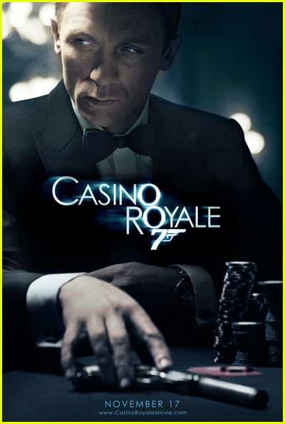
It might surprise you to learn that, not only is the background completely photoshopped from brushes (there is a very blurred out and nearly transparent picture of a house, just to give random variation of tone), including the lights, which are just several layers of the same things but slightly different opacities and colors, but the figure is actually made of up of three different images! One for my hand, one for my body and one for my head. As I was shooting this myself, running from camera to seat and posing in ten second, it was hard to get it completely right. So I just photoshopped it together. I think it's perfectly okay in this situation (unlike here, where I would have preferred to do it right during the shoot). In fact, I prefer photoshopping things for posters, I feel it's on of the few acceptable places to do so, and therefore I want to take advantage. As long as I never churn out anything like this Huckleberry Finn poster. First of all, it doesn't even look like Jim is running. But the worst part is, if you see the movie, you know the body of Elijah Wood is actually another character altogether. It's... I mean, the poster's purpose is to make one want to see the movie, but once one does, it's obvious the body belongs to someone else!
I've been holding that in for years.
No comments:
Post a Comment